When creating a website, it's important to know your audience. Users of the website are primarily the members of the quilting guild. The guild is located in Orleans, Ontario and has roughly 200 members. They meet on the second Tuesday of every month at a community centre.
Description of the guild's members:
-
- They are all avid quilters;
- They are all women;
- The average age is probably 65;
- A large number are retired;
- They love colour and patterns;
- They love contests and draws;
- They are very generous. Many quilts are made for various community organisations;
- Most of them are interested in traditional quilting;
- A minority are interested in art quilts, modern quilts and art wear; and
- Most members can use, and have access to, the computer and email.
 |
| Traditional Scrap Quilt |
Purpose of the website
The guild's Internet site is used primarily to inform its members. This includes:
 |
| Quilt Guild's Home Page |
- A description of the upcoming month's program;
- that month's newsletter; as well as
- information about:
- workshops,
- quilting retreats,
- favourite recipes from the retreats,
- community projects,
- books and magazines available in our library,
- challenge results, as well as
- details on the upcoming quilt show.
There is a page of quilting links that seems to be appreciated by people interested in quilting, but this is not our target audience.
Design of the website
Design of the website
With the audience and purpose in mind, the website should be:
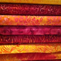
What about using some of these batik colours as background with a white or cream table to hold the content? These could provide a colourful punch!
- Simple to navigate and find things;
- Informative and contain to-the-point information;
- Designed with slightly larger font for easy reading;
- Pleasant to look at - with colour and pattern;
- Light and friendly.
For this week's assignment, I had to create an html document by hand. It was a LOT of work but great fun (who knew I had an inner geek!). The webpage that I designed is actually this post, except that the layout was much better. I did go into the html of this page, but because it's a template, there's a lot of very confusing formatting. Here's a picture of what my hand coded page looked like. It's simple but at least things like images stay where they are supposed to be.


No comments:
Post a Comment