 |
| Original Layout |
 |
| Layout version 2 |
 |
| http://www.faubourg.com/ |
After submitting version 2 of my layout, I learned about communicating the content and the feeling, and html. I posted a blog on June 19 about Knowing Your Audience and after that looked at all kinds of website and examined my design biases.
That’s a lot of learning!
I wish I could have created my desired website in html. I have to admit that I did attempt it, but I’ll be needing a lot more practice before I get that good! So, I used a tool that I’m very familiar with to make a mock up – Microsoft Publisher. Here’s the result.
It's basically my version 2 layout since I think that it’s versatile, can highlight great quilts and gives members the information they need without too much content. I’ve used the “full-screen photo” layout. The most important information, about our next Guild meeting, is located in the box within the photo area. There’s also a link to “Get Directions” for new members. The photo could be changed every month, using photos of members’ quilts (this one is mine). The three boxes below will contain timely information. If there is a lot to communicate, these boxes can be cut in half horizontally to make more boxes; they can be extended; or information can be moved, such as putting the link for the newsletter within the top box if needed.
 |
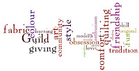
| Quilt Wordle |
In my opinion, a quilting guild website isn’t complete without colour, pattern and fabric. As well, the use of the colours can evoke feelings, as seen in our Meaning of Color Handout. Here are the meanings of the colours used in the site (yellow and orange) that evoke the feelings discussed above.
Orange—Ambition, fun, happy, energetic, balance, flamboyant, warmth, enthusiasm, generosity, vibrant, expansive
Bright Yellow—Cheeriness, joy, action, optimism, happiness, idealism, summer, hope, imagination, sunshine
Depending on the photo of the quilt used on the page, the colour of the colour of the area below it, including the three boxes, could be changed, especially if it clashes with the image! I think that this website will inform the members, be easy to navigate; be pleasant to look at; and show quilters' love of fabric, design and colour.


Ha, I see this is the look you have in mind for CTQG. Would this fit without scrolling on any size screen? That's important. Right now, we're losing the buttons that extend beyond the usually small amount of text on the main page. It's a pleasant, updated look. Nice work.
ReplyDelete