Thursday, 27 June 2013

Principles of Design

This week we are looking at some of the principles of design. Since the author of the article Principles of Design mentions that design of anything, even art, starts with these principles, I thought I would go through the principles using quilts to illustrate them.

Balance consists of the visual weight given to the objects in the design. It can be either symmetrical or asymmetrical.

Horizontal and vertical symmetrical balance
Symmetrical balance occurs when the visual weight of the objects in a design is evenly distributed. The balance can be horizontally or vertically symmetrical – meaning that it's symmetrical around the horizontal or vertical axis. This table runner has both horizontal and vertical symmetry.

Approximate vertical symmetry
Approximate vertical symmetry occurs when there is symmetry because both sides are similar but not identical. This quilt has approximate vertical symmetry because the smaller rectangles have different widths but end up taking the amount of area.

Radial symmetry
Radial symmetry occurs when the objects are symmetrical around a centre point. The centre of this Dresden Plate block has radial symmetry. The rest of the block, outside of the centre, has vertical and horizontal symmetry.
Asymmetrical

A design is asymmetrical when the visual weight of an object is not evenly distributed.  This design often has a dominant form that is offset by other, smaller forms. This creates visual tention. The Christmas hanging to the right is asymmetrical. The bells are the dominant forms.

Rhythm is attained through the repetition or regular change of elements. When elements have defined space between them, this often creates a sense of movement.

Regular rhythm occurs when the objects and the space between them are similar in length or size. This Christmas runner is both symmetrical and has rhythm.
Symmetry and rhythm

A flowing rhythm achieves a sense of movement. This wall hanging has a sense of movement about it, especially through its wavy horizontal lines at the top. 
Wall hanging with flowing rhythm


Card trick block - progressive rhythm
A progressive rhythm occurs when a sequence of forms go through a progression of steps. This block is a card trick block. It has progressive rhythm as the cards progress into a circle.


Proportion is the relationship in scale between the objects of a design. Adding elements of different proportions can give a design weight and depth.

Within a design, dominance is the amount of emphasis or visual weight that an element receives.
Flower Show Quilts

A dominant element will have the most visual weight.

The sub-dominant element will have secondary emphasis - usually found in the middle-ground of the design.

The subordinate element will have the least amount of visual weight and will recede into the background.

I chose this quilt because it doesn’t really follow the usual rule. The dominant element is the sunflowers. They are not located in the foreground, but I believe they carry the most visual weight. The violets in the foreground would be the sub-dominant element while the fence and the sky would be the subordinate elements.

The Dresden Plate block has great negative space to quilt in
Unity - Here is one of the concepts within unity that is discussed a lot in quilting.

Positive space is what’s in the foreground while the negative space is the background.

The Dresden plate block here makes the most of its negative space through the hand-quilting in that space. Modern quilters talk a lot about using negative space since many modern quilts have more negative space than most traditional quilts.

Now it's a matter of translating these design principles to website design.

Tuesday, 25 June 2013

Final Quilt Guild Design

This week our assignment is to revisit our original design and make any necessary changes, based on our learning to date. Let’s go back to the beginning of the course for a re-cap. My original design was done before I learned anything about design. Here it is.
 
Original Layout
In the weeks that followed that design, I learned about layout and navigation. Here's my layout - version 2.

Layout version 2
The comments bubbles are my naviation details (7+ or - 2). I may have cheated since I didn't count "Home". Two of the categories have 3 levels. The top navigation bar is the most important. I used a variation of a "full screen photo" layout and was inspired by http://www.faubourg.com/.
  
http://www.faubourg.com/


After submitting version 2 of my layout, I learned about communicating the content and the feeling, and html. I posted a blog on June 19 about Knowing Your Audience and after that looked at all kinds of website and examined my design biases.

That’s a lot of learning!

I wish I could have created my desired website in html. I have to admit that I did attempt it, but I’ll be needing a lot more practice before I get that good! So, I used a tool that I’m very familiar with to make a mock up – Microsoft Publisher. Here’s the result.


It's basically my version 2 layout since I think that it’s versatile, can highlight great quilts and gives members the information they need without too much content. I’ve used the “full-screen photo” layout. The most important information, about our next Guild meeting, is located in the box within the photo area. There’s also a link to “Get Directions” for new members. The photo could be changed every month, using photos of members’ quilts (this one is mine).

The three boxes below will contain timely information. If there is a lot to communicate, these boxes can be cut in half horizontally to make more boxes; they can be extended; or information can be moved, such as putting the link for the newsletter within the top box if needed.

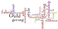
Quilt Wordle
Based on my June 5th blog, Evoking Emotions Through a Website, I think that I have captured some of the feelings I was trying to evoke.

In my opinion, a quilting guild website isn’t complete without colour, pattern and fabric. As well, the use of the colours can evoke feelings, as seen in our Meaning of Color Handout. Here are the meanings of the colours used in the site (yellow and orange) that evoke the feelings discussed above.


Orange—Ambition, fun, happy, energetic, balance, flamboyant, warmth, enthusiasm, generosity, vibrant, expansive
Bright Yellow—Cheeriness, joy, action, optimism, happiness, idealism, summer, hope, imagination, sunshine

Depending on the photo of the quilt used on the page, the colour of the colour of the area below it, including the three boxes, could be changed, especially if it clashes with the image! I think that this website will inform the members, be easy to navigate; be pleasant to look at; and show quilters' love of fabric, design and colour.

Friday, 21 June 2013

Understanding my Design Biases

I’ve had a wonderful day. I spent a part of it surfing the web (I love that expression – especially since it’s the only surfing I’ll ever be doing!) for interesting designs on the web. I started off doing a Google search on things such as “best website design”. Since there are so many websites, I guess I shouldn’t be surprised at the amount of sites that highlight excellent design.

From there, I found some great web designer sites. It was a real thrill since I saw sites that I would never have found otherwise. Let’s face it, I’m not part of the target market for 95% of sites on the Internet!

As I saw great website designs, it didn’t take me long to decide what I liked – hence the possible biases. I definitely am attracted to clean simple designs, with either lots of white or cream space but of course, some use of colour. I realised that I dislike predominantly black websites as well as very busy, cluttered sites. I do think though, that most of the black websites with lots of stuff on them are usually geared to young people.

Lounge Lizard


Here are some screen shots of what I think are cool site designs. The first three sites were all created by Lounge Lizard. It was difficult to keep my examples to three.
Lounge Lizard's website
This one is a little on the dark site, but it's an important part of the look. The items on the bar are very appropriate and are used for navigation.  I saw a few sites using this technique but I found that many of them were confusing. This one is not! There's even movement, including a flickering candle.

Their website is relatively easy to navigate. They showcase a lot of websites that they designed for clients. I particularly like their "case studies" section. I'm sure that it helps potential clients see themselves and gives them a feel for what the company can do. As a student, it gives me insight into how these sites were developed.

Alakef Coffee Roasters


Alakef home page
This is a more traditional design.  I really like their use of texture. It looks great and gives us the feel of jute coffee bags and South America. I found that the subtle colours in the background added interest without distracting from the content.

The site is very easy to navigate. They have their online shop as well as a very thorough section about coffee, called “Become an expert” which even includes a quiz. There is a good video explaining the company’s coffee roasing process that highlights their passion for great coffee.


Sedoni Gallery


Sedoni Gallery home page
I really like the simple, clean look of this site. Each navigation button for their products is written in a different font, which in some way is connected to the items found in that section. It could have been distracting, but I think that because there's a lot of white space between them, it's effective.

The look of the page, with the uneven black border accentuates the products on the page. The swipe of paint behind the “Welcome”, “Gift Registry”, “Gift Card” and “Shopping Bag” (instead of a cart) make the navigation obvious while looking artistic and carefree. The website highlights the assortment of textures to be found in the gallery through the use of a wonderful textured background and a navigation bar (at the top right) that looks like it’s on sand.

The headings for each product section are striking. They illustrate the section with a rich, beautiful look that is very much in line with their upscale clientele.

Bastian+Skoog Flower Studio


Bastian+Skoog home page

 Here's a company, Eight Hour Day, that creates some great websites.

Bastian+Skoog's website is pretty incredible. Of course, it's an upscale flower studio, so it probably needs to be incredible. I did find it a little difficult to navigate. At first I thought that it was my lack of experience using the web since I'm still not used to navigation buttons that slide in and out of the sides of the screen. However, after checking out the site a few times, their navigation depends on using the "back" button on the browser. A minor inconvenience, but I do think that users should have more than one choice about how they want to navigate around a website.

Here's the page that come up if you click on weddings from the home page. This is the page that caught my eye when I was on the designer's website. Once you're inside the wedding page site, it's a veritable feast for the eyes. The flowers are stunning.

I'm showing this page because the yellow background was designed by Eight Hour Day. They did a yellow design like this for each page. I found these very compelling.


These are some of the designs I like. Why could that lead to biases? Well, these are designes that I like and am attracted to. That’s fine for my personal choice, but when we are creating a design for a specific audience, it’s important that the design is appropriate for that group. If I am a part of their target market, then it’s probably less of a problem; but if the market is teenages, then the designs I like are probably not suitable.

Wednesday, 19 June 2013

Knowing Your Audience

As you may have read previously, for my class project I am re-designing my quilt guild's website.

When creating a website, it's important to know your audience. Users of the website are primarily the members of the quilting guild. The guild is located in Orleans, Ontario and has roughly 200 members. They meet on the second Tuesday of every month at a community centre.

 Description of the guild's members:
     
    Traditional Scrap Quilt
    
  • They are all avid quilters;
  • They are all women;
  • The average age is probably 65;
  • A large number are retired;
  • They love colour and patterns;
  • They love contests and draws;
  • They are very generous. Many quilts are made for various community organisations;
  • Most of them are interested in traditional quilting;
  • A minority are interested in art quilts, modern quilts and art wear; and
  • Most members can use, and have access to, the computer and email.

Purpose of the website

The guild's Internet site is used primarily to inform its members. This includes:

Quilt Guild's Home Page

  • A description of the upcoming month's program;
  • that month's newsletter; as well as
  • information about:
    • workshops,
    • quilting retreats,
    • favourite recipes from the retreats,
    • community projects,
    • books and magazines available in our library,
    • challenge results, as well as
    • details on the upcoming quilt show.
There is a page of quilting links that seems to be appreciated by people interested in quilting, but this is not our target audience.

Design of the website
With the audience and purpose in mind, the website should be:
  • Simple to navigate and find things;
  • Informative and contain to-the-point information;
  • Designed with slightly larger font for easy reading;
  • Pleasant to look at - with colour and pattern;
  • Light and friendly.
What about using some of these batik colours as background with a white or cream table to hold the content? These could provide a colourful punch!


For this week's assignment, I had to create an html document by hand. It was a LOT of work but great fun (who knew I had an inner geek!). The webpage that I designed is actually this post, except that the layout was much better. I did go into the html of this page, but because it's a template, there's a lot of very confusing formatting.  Here's a picture of what my hand coded page looked like. It's simple but at least things like images stay where they are supposed to be.


Monday, 10 June 2013

Using Fibonacci Sequence in Web Design and Quilting

Here’s another fascinating concept – if you like math!

In our textbook, Universal Design Principles, the authors discuss the Fibonacci Sequence.  It’s “a sequence of numbers in which each number is the sum of the two preceding numbers” (e.g., 0 +1=1; 1+2=3; 2+3=5; 3+5=8; 5+8=13; 8+13=21; 13+21=34; 21+34=55).  
It’s used in music, art and architecture to achieve “harmonious” designs. For those who like math, it’s a concrete rule that helps achieve a look that is backed up by logic and math.

I first heard of the Fibonacci Sequence when visiting the Sagrada Familia in Barcelona. The architect, Gaudi, used many examples of nature in his designs, including the Fibonacci Sequence. Here’s a church to blow your mind. It’s like looking at a Gothic, organic Sci-fi movie. Here are a couple of pictures!

The outside of the Sagrada Familia

Inside the Sagrada Familia


Many of the pages on the web discuss the Fibonacci Sequence as well as the Golden Ratio, which is based on the Fibonacci Sequence.  Both of these concepts are used for things such as the relationship between the content area of the page and the sidebar, or figuring out the measurements of your text and your headers. The ratio, apparently is 1:1.61. There are even ratio calculator apps available to help you figure it out.
Here are a couple of blogs that have more information:

Ricky Tims' Fibonacci Sequence


Since my final project will be designing a quilt guild website, I thought I would check out the Fibonacci Sequence and Quilting since quilting is very math based (if you want it to be). It turns out that one of the gurus of the quilting world, Ricky Tims has created this quilt using the Fibonacci Sequence.

Isn’t it stunning?

Here's to harmonious designs!


Wednesday, 5 June 2013

Evoking Emotions Through a Website

In our first assignment, we had to find a website that uses images to represent what Victoria Day meant to us.  To me, “Victoria Day represents all things English and Victorian. My favourite English tradition is High Tea - the beautiful restaurant setting, the elegant table of white linen and frilly china, the food that is so pretty that it can't possibly taste as good as it looks, and of course, the choice of exotic teas with amazing aromas.”
High Tea at the Ritz-Carlton
  
Can a website make the viewer feel these things? 
Why not? 

How does this web page make you feel? 

Does it tantalize your senses?


As we go through the course, we have to design a website using the knowledge we learn along the way. I’ll be redesigning our quilting guild’s website.
 
As a starting point, based on this exercise, what do the words “quilting” and “guild” represent or bring to mind? 


I think that these are some of the things that should come out through the website’s design.


Tuesday, 4 June 2013

New and Interesting Concepts

For my Visual Design and Display of Information course, I will be keeping a blog of my learning. All I needed was an excuse for another blog. So here it is:


Affordance


Teapot
Door


Light switch

This teapot, this light switch and this door have affordance..... they each have a quality about them that lets you use them to carry out an action. The teapot has a handle to hold and a spout to pour tea; the light switch can be flicked up or down to turn on or turn off the light; and the door has a handle to turn to open or close it.
How cool is that?

Word 2007 logo
So, speaking of affordance, how were we supposed to know that the logo had to be clicked when Word 2007 came out? I swear it took me days to figure it out! 
I am now going to look for affordance everywhere!