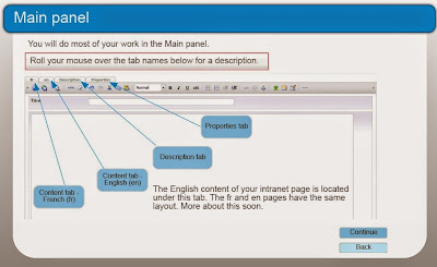
Graphics or images need to be:
- Relevant or appropriate;
- Understandable; and
- Useful in the communication of the ideas presented.
 |
| A clean layout with consistent font, colour and shapes |
As much as images are required, I believe that it’s just as important to use consistent font, colours and shapes (such as buttons). This makes the elearning look professional and helps users know what to expect.
The other point is to avoid at all cost the “wall of words”. Using images is one way of breaking things up. In my opinion the best way to avoid the wall of words is to keep the words to an absolute minimum. This is done by conveying what is necessary and leaving out the “nice to know”. I have found a great resource in Lisa M. Russell’s documents, including Clean the Clutter of your Words.
I have been reading and using the book, White Space is Not Your Enemy (WSINYE) by Rebecca Hagen & Kim Golombisky. It’s informative with lots of examples, both good and bad. I highly recommend it.
 |
| White Space is Not Your Enemy |
As for designing graphics, I seriously looked into learning software more technical than PowerPoint, the Snipping Tool and Paint. I use Photoshop minimally but I decided to spend my energy deepening my knowledge of design and development of elearning rather than graphics. At this time in my career, having some knowledge of web design is more important than becoming a graphic artist. If I need to, I can always hire a graphic designer.
What I've learned:
- I can't learn it all, especially if there is a steep learning curve! Graphic design will have to wait for a next life.
- I have a much better chance at becoming good at elearning and web design than graphic design.
- It's still pretty amazing what I can do with PowerPoint, the Snipping Tool and Paint!


